![EOScu Logo - Dark - Outlined [07182023]-01](https://blog.eoscu.com/hubfs/Eoscu_June2024/Images/EOScu%20Logo%20-%20Dark%20-%20Outlined%20%5B07182023%5D-01.svg)

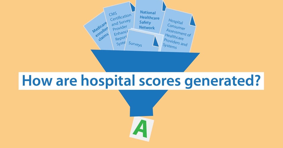

Have you ever wondered how hospital scores are created? As we have explored in previous posts,...
Why do HAC Scores Look Different?
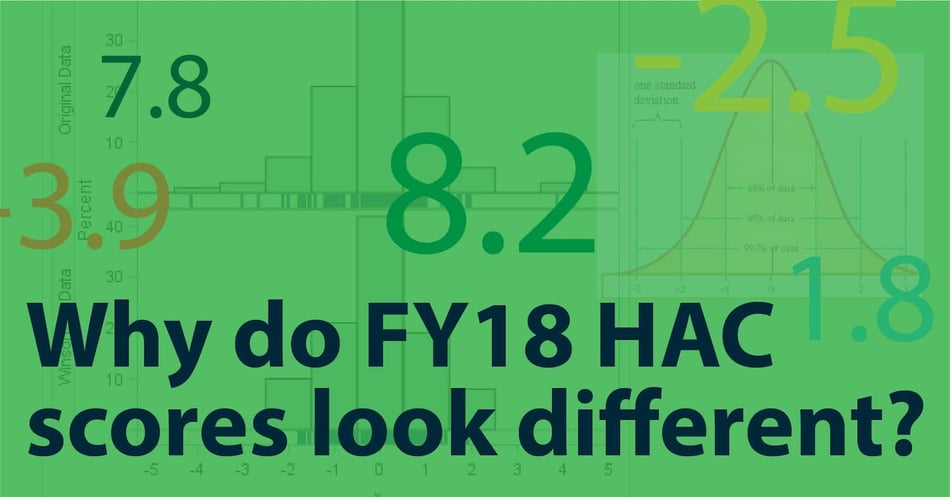
Since the inception of the Hospital-Acquired Condition Reduction Program (HACRP) in 2015, those of us involved in the world of hospital infection control have become used to looking at HAC scores. For a few years, these hospital scores have been expressed as a number between 1 and 10. Now, HAC scores look different: They can be positive or negative, and only seem to be between -3 and +3. What gives?
Let's first look at what is the same. Hospitals are still scored in two domains, with Domain 1 making up 15% of the final score, and Domain 2 making up 85% of the score. The makeup of Domain 1 has changed slightly, but the overall areas that are scored has remained the same. Penalties are also still given to the bottom-performing quartile, that is, the worst-performing 25% of all hospitals.
Even though what is scored has not changed, scores from previous years cannot be compared with FY18 scores.
What did HAC scores first look like? Within each domain, hospitals received a decile score from 1 to 10 for each Patient Safety Indicator (Domain 1) and for a selection of hospital-acquired infections (Domain 2). Scores were averaged for each Domain, and then the final HAC score was calculated by giving Domain 1 a weight of 15% and Domain 2 a weight for 85%. Final scores were therefore a number between 1 and 10.
This scoring system resulted in some challenges. One of the major issues was that there were too many ties right at the penalty threshold. Remember, the law requires hospitals in the lowest quartile to receive penalties.
Let's say there are 100 hospitals. The law says that the lowest-performing 25 hospitals have to pay a penalty. Counting from the lowest score up, things start off going smoothly - the bottom 23 hospitals receive scores from 1 to 3.3. However, 5 hospitals receive a 3.4. If all 5 hospitals have to pay a penalty, that would mean the bottom 28 hospitals have to pay, which is not permitted under the law. How do you decide which of those 5 hospitals has to pay a penalty, and which do not?
Enter Winsorized z-scores.
Z-scores | How much a number differs from the mean
After months of review by a technical expert panel, the scoring methodology was changed to reduce the number of ties. Under the new methodology, scores represent the distance from the average for each area measured, that is, a z-score. No measure is given a score between 1 and 10, instead, the actual raw measures are used. (Raw = Actual rate for a measure, such as infection rate, fall rate, open wound rate, etc.)
Let's take just one Patient Safety Indicator as an example. PSI 03 is the Pressure Ulcer Rate. Each hospital will have a rate at which pressure ulcers occur at their facility. All the hospitals' pressure ulcer rates will be averaged to get the mean. Then hospitals will get a z-score that reflects how much above or below the mean their own rate is. A hospital whose rate is below the mean will get a negative z-score (eg. -2.1), a hospital whose rate is above the mean will get a positive z-score (eg. 2.1). The lower the score, the better the performance.
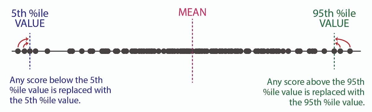
Winsorization | A way to make a mean less affected by extreme outliers
Since the average now plays such a critical role in how a hospital is scored, it was imperative to make sure that mean best reflected the hospital scores. But isn't a mean an objective calculation? Yes and no. An average can be tremendously affected by just one outlier (as anyone who has ever seen their grade tumble after just one bad test can confirm!). That outlier, although still relevant for that one hospital, could unnecessarily impact all the other hospital scores.
To counter this impact, Winsorization is used. Using the raw PSI and infection results, the 5th and 95th percentile values are calculated. If a hospital's result falls below the 5th percentile value, then their result is adjusted up to that 5th percentile value. If a hospital's result falls above the 95th percentile value, then their result is adjusted down to the 95th percentile value. Raw measure results and Winsorized measure results between the 5th and 9th percentile will be the same. Then the mean is calculated with this new data set, resulting in a Winsorized mean.
Finally, z-scores for this Winsorized mean are calculated and you get your Winsorized z-score. This final z-score is the difference from the Winsorized mean.
For FY18, hospitals and stakeholders will see a HAC score that is somewhere between -3.0 and +3.0. This score shows how far above (bad) or below (good) the average score that hospital ranked. As the community adjusts to this new scoring methodology, and more years of data accrue, we will hopefully come closer and closer to more meaningful data that helps support healthcare improvement.
![[infographic] Hospital Ratings Data Sources Download and share!](https://no-cache.hubspot.com/cta/default/216314/interactive-178908753580.png)