![EOScu Logo - Dark - Outlined [07182023]-01](https://blog.eoscu.com/hubfs/Eoscu_June2024/Images/EOScu%20Logo%20-%20Dark%20-%20Outlined%20%5B07182023%5D-01.svg)


In a widely-circulated interview, President Biden stated that the pandemic was, in effect, over....
Leapfrog's Lives Lost-Lives Saved Report: Behind the Numbers

 Those of us who work in the world of infection prevention can sometimes struggle to quantify our successes. While overall reductions in infection and adverse events can be counted, it's been difficult over the years to state how many infections were prevented; it's hard to count things that don't happen. A new way to quantify success in infection control may shed some light on this quandary: The new Lives Lost, Lives Saved report from the Leapfrog Group. In today's post, we'll look at their methodology and conclusions.
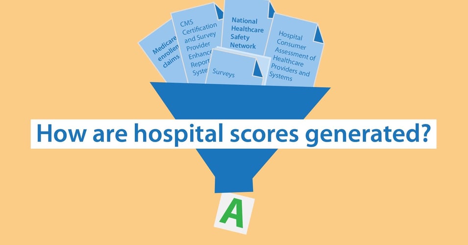
We have covered the Leapfrog Group in a previous post about hospital scoring and ranking organizations. Briefly, this nonprofit watchdog group was founded in 2000 by a group of large US employers and other purchasers of health insurance with the mission of improving the quality of healthcare. Inspired by the call to action from the recently published institute of Medicine report To Err is Human, the resulting organization set out to ensure that best practices were adopted by hospitals and that the consumer was informed about the quality of care at facilities near them. The Leapfrog Group set about this mission by creating a set of healthcare measures and collecting data. They take data from the publicly reported Centers for Medicare and Medicaid Services (CMS) and combine it with their own surveys. Finally, they assign a letter grade to each facility twice a year, ranging from the best, "A", to the poorest performing, "D" and "F". Consumers can go to the Leapfrog Group's website and search for a hospital and see the letter grade as well as how well the facility performed on each of the measures. The Leapfrog Group Hospital Safety Grade currently provides information about patient safety about almost 3,000 facilities with a focus on patient safety: Errors, injuries, accidents, and infections.
It is from the data they pull for their Safety Grade that the Leapfrog Group's new report attempts to quantify the numbers of lives that could be saved if lower-ranked hospitals performed at the levels of "A" hospitals. In conjunction with the Johns Hopkins Armstrong Institute for Patient Safety and Quality, the Leapfrog Group sought to make the connection between 15 Hospital Safety Grade measures and mortality risk. This is how they did it:
- They knew, based on the literature, what the attributable mortality rate was for each measure (the mortality rate that was due to just the condition, accounting for underlying illness). For example, for patients with a central line-associated bloodstream infection (CLABSI), the attributable mortality rate is 18.5%.
- They calculated the mean incidence rate for each measure for each grade level in aggregate (how many cases identified during the 2 years of data). For example, they calculated that at "A" hospitals overall, the mean incidence rate of CLABSI per 1,000 hospital admissions was 0.12%, while at "D" and "F" hospitals combined, it was 0.24%.
- To estimate the mortality rate for each measure for each letter grade, they multiplied the attributable mortality rate by the mean incidence rate at each letter grade. To account for mortality being shared with multiple measures (a death may be as a result of both CLABSI and MRSA), the resulting mortality rate was then reduced by 50%.
- They used data from the 2017 American Hospital Association's Annual Survey to identify the number of hospital admissions at hospitals at each letter grade.
- Finally, they estimated the number of lives lost at hospitals at each letter grade by using the calculated mortality rate with the admissions data, and applied the "A" grade mortality rate to each lower graded hospital to calculate the difference.
|
18.5% Mortality Rate for CLABSI melody |
x |
0.12% Incidence Rate for CLABSI at "A" hospitals |
÷ |
2 50% reduction to account for multiple measures |
= | Mortality rate for CLABSI at "A" hospitals |
The results give a number to "what might have been." Based on their findings, 50,000 lives could be saved annually if all hospitals performed at the levels required for an "A" grade. Patients at "D" and "F" hospitals face almost 2x risk of mortality due to avoidable medical errors, including HAIs.
Interestingly, while "D" and "F" hospitals have the most dramatic relative risk of an avoidable death compared to "A" hospitals, 87.7%, these hospitals only account for 5.5% of hospital admissions. A revealing number of this study that isn't getting the same kind of coverage is 34,775: The number of lives that could have been saved at "C" hospitals. These hospitals, which account for the highest percentage of admissions, 35%, account for the overwhelming majority of avoidable deaths due to medical error, injuries, and infection. Supporting these hospitals in improving their patient safety procedures and protocols would save the most lives each year.
This report doesn't necessarily have results that can be written in stone as 100% accurate. By their own admission, these results are estimates, and in many cases, underestimates of the lives saved and lives lost due to lapses in patient safety, including HAIs. But these reports bring attention and a way for the general public to quantify the variations in patient outcomes between different hospitals in their own communities. We hope the results of these and other reports is to empower the general public to demand more from their local hospitals, for those "C" level hospitals to see what they can improve to save more lives, and for consumers to make better educated decisions about to where to seek their medical care.